CO-DESIGNING the BEDSIDE CHATS WEBSITE
UX & UI: surveys | interviews | qualitative analysis | prototyping | iterating | visual design
OVERVIEW
Bedside Chats is a digital tool to guide conversations between physicians and patients. The mobile app is designed to help patients remember questions they want to ask during a doctor visit and helps them find information related to their specific health concerns or needs.
The student design team worked with the medical device inventor team to determine improvements that benefit users and stakeholders as the product is brought to market.
Users: patients
Stakeholders: health care systems, families, and support groups
Competition: sources where patients access medical information
Project Objectives:
Validate whether the digital tool provides added benefit for patients compared to how they normally prepare for a doctor’s visit.
Establish whether the concept has support from industry professionals.
Apply co-design methods throughout the process to gain user insight and feedback to inform improvements to the user experience.
Develop the framework for a desktop-based website version.
My Roles: Constructed survey and interview templates, built low and high-fidelity prototypes, led and observed participant sessions, performed analysis, and created the style guide for future website development.
DEFINING THE FOCUS
Objectives:
Uncover potential experiential issues of Bedside Chats.
Determine the project’s focus.
Identify the target demographic for co-design sessions.
To find possible user experience issues, three criteria were used to assess the current app: usefulness, usability, and desirability.
Because of the perceived difference in technology skills among different generations, it was predicted that age is the most influential factor affecting how patients would rate the app across the criteria. The following activities helped the project team collectively decide on project priorities.
Scorecard Activity: Team members rated the criteria based on the predicted behavior of younger patients, older patients, and healthcare practitioners.
Each criteria was scored on a scale of 1 (least)–10 (most) based on project member’s assumptions and preconceptions of each user group.
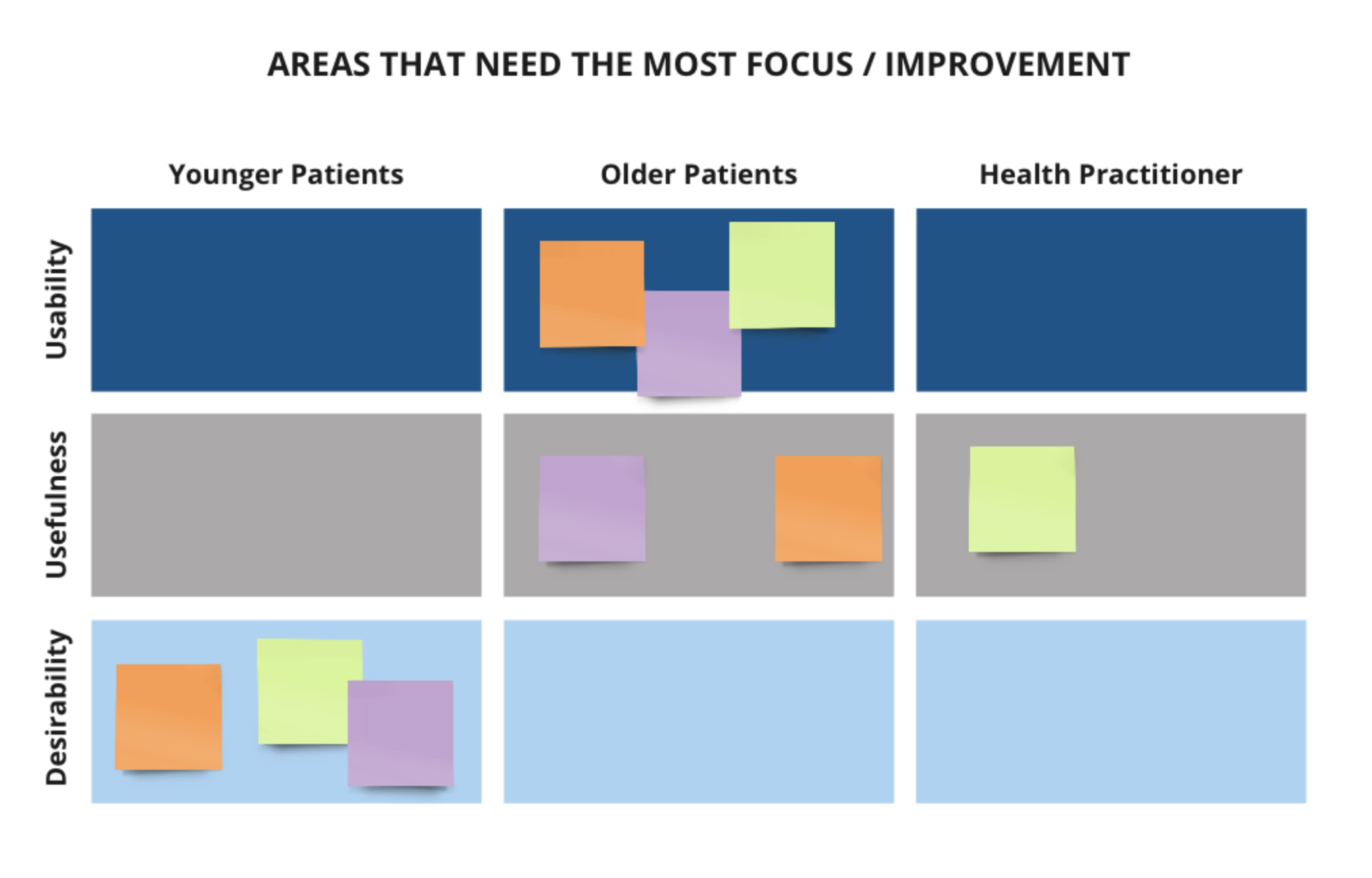
Voting Activity: To narrow the scope of the project the inventor team determined which combination of criteria and user group they believed needed the most improvement.
Each team member placed 3 votes for the user
group / criteria combination believed to need the most improvement.
Results:
Two pain points emerged: usability for the older demographic, and desirability for the younger. To further refine project parameters, two patient stakeholder groups were established based on preconceived differences in technology usage and healthcare visits: users 50 and above, and users under 50.
Patients ages 50+ was determined as the target user group because it is believed that this cohort is less confident using technology and more likely to experience difficulty with navigation. Additionally, these patients tend to have higher numbers of medical conditions when compared to those under 50 and are likely to reap the most benefit.
STUDY DESIGN
Goals:
Assess if the concept is desirable to the 50+ demographic and those in the healthcare industry by conducting interviews and co-design sessions.
Create a low-fidelity website mock-up and prototype to assess functionality and the features this target group would want and need.
Incorporate user feedback to generate a high-fidelity website mock-up and prototype.
Recruitment:
Two participant types: patients ages 50 and older, and industry experts (healthcare professionals).
Participant Sessions:
Part 1–Survey & Interview
To gather data on patients’ typical doctor visits, patient participants completed a survey prior to meeting virtually to establish past healthcare experiences and gain insight into their current technology usage. Responses served as both a starting point and guide for interviews where participants had the opportunity to expand on survey answers with detailed explanations.
Interviews with healthcare professionals and experts utilized a separate interview guide in order to understand a typical patient visit from their perspective and the possible challenges related to patients’ level of knowledge and information access about their health.
Part 2–Low-Fidelity Prototype
During each session all participants explored a low-fidelity website prototype. Feedback was gathered as they navigated the prototype and verbally reflected on their lived experience as a patient or healthcare professional.
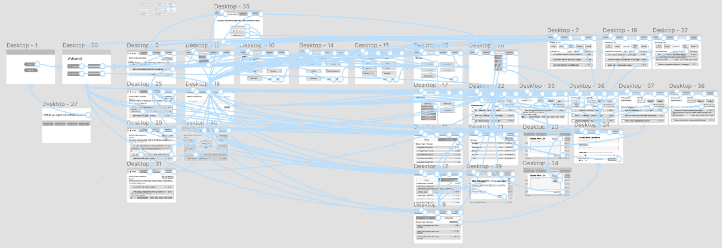
The low-fidelity prototype focused on content and functions of the website. Users were able to interact with this prototype, talk through their thought process, and provide feedback.
prototype connections for the low-fidelity website
ANALYSIS
The Doctor Visit Experience:
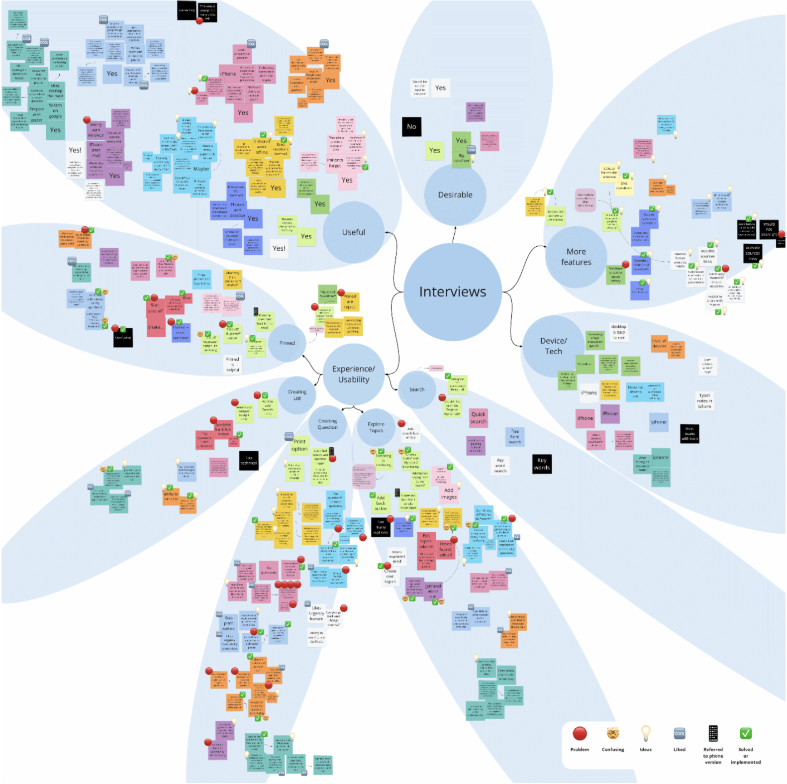
The surveys and interviews revealed how the doctor visit experience would change and benefit users throughout different phases of the process when using Bedside Chats.
Insights:
Users want to explore reliable resources to aid in preparing questions especially when experiencing a new health scenario.
Users would like a convenient way to keep an organized list of questions.
Users want to easily keep an accessible historical record of past questions and answers.
Low-Fidelity Prototype:
Data was clustered based on the 3 criteria of usefulness, usability, and desirability. Usability was further broken down into the website’s main functions to more accurately determine what would need to be addressed in the high-fidelity prototype.
Insights:
Users are confused by the term “pinned” and its intended purpose and need simplified navigation and straight forward language to better understand the website’s main functions.
Users want to include trusted individuals for support in the doctor visit experience (e.g. sharing questions with family members).
To prevent having too many questions for a doctor, healthcare professionals want a way to prioritize listed questions.
Users who don’t frequently work with technology may benefit from a step-by-step guide to reduce the frustration of learning and working with unfamiliar technology.
Users want reassurance that their personal medical information won’t be shared with unauthorized persons when using this tool.
HIGH-FIDELITY PROTOTYPE
A high-fidelity prototype was developed based on feedback from co-design sessions and insights from analysis.
Changes and Additions:
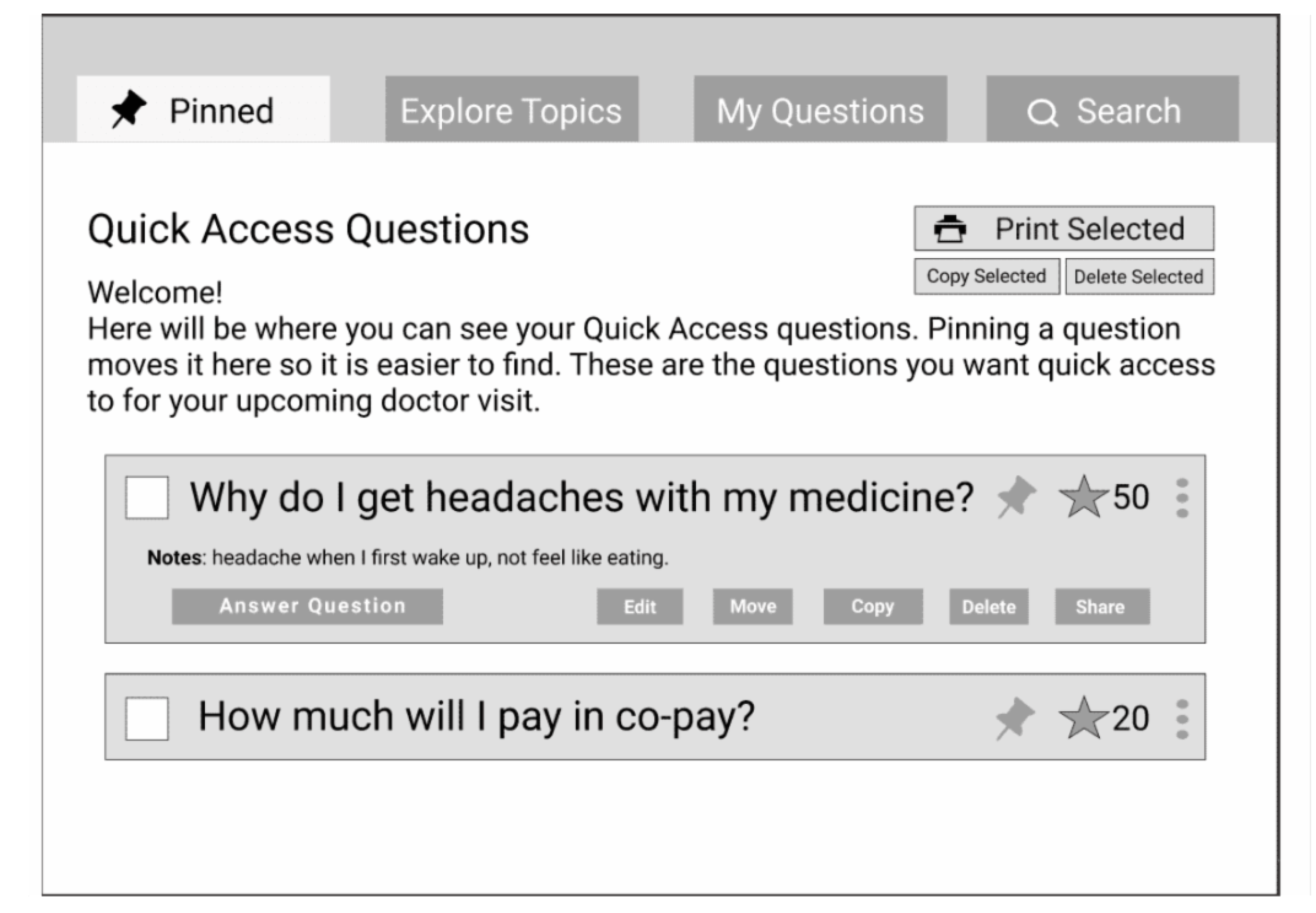
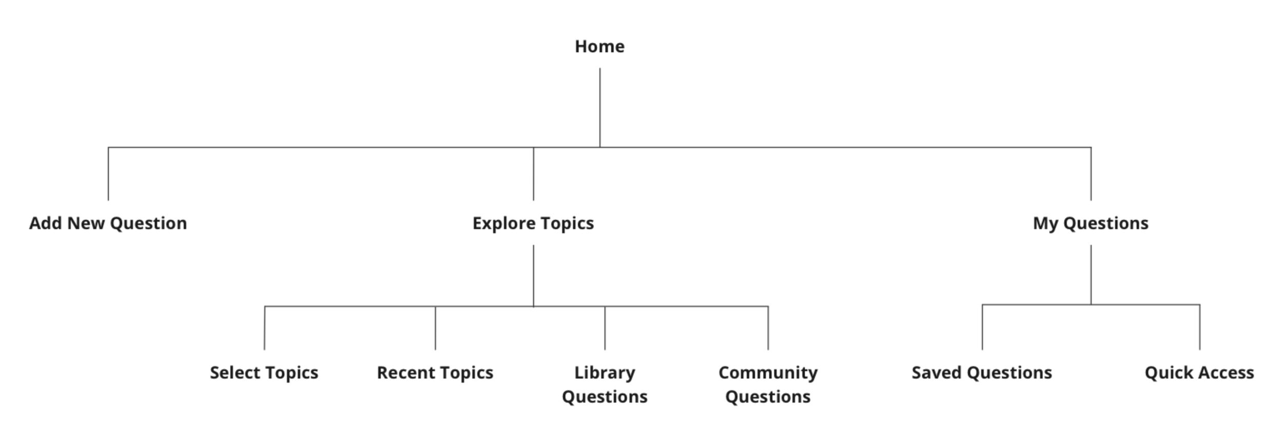
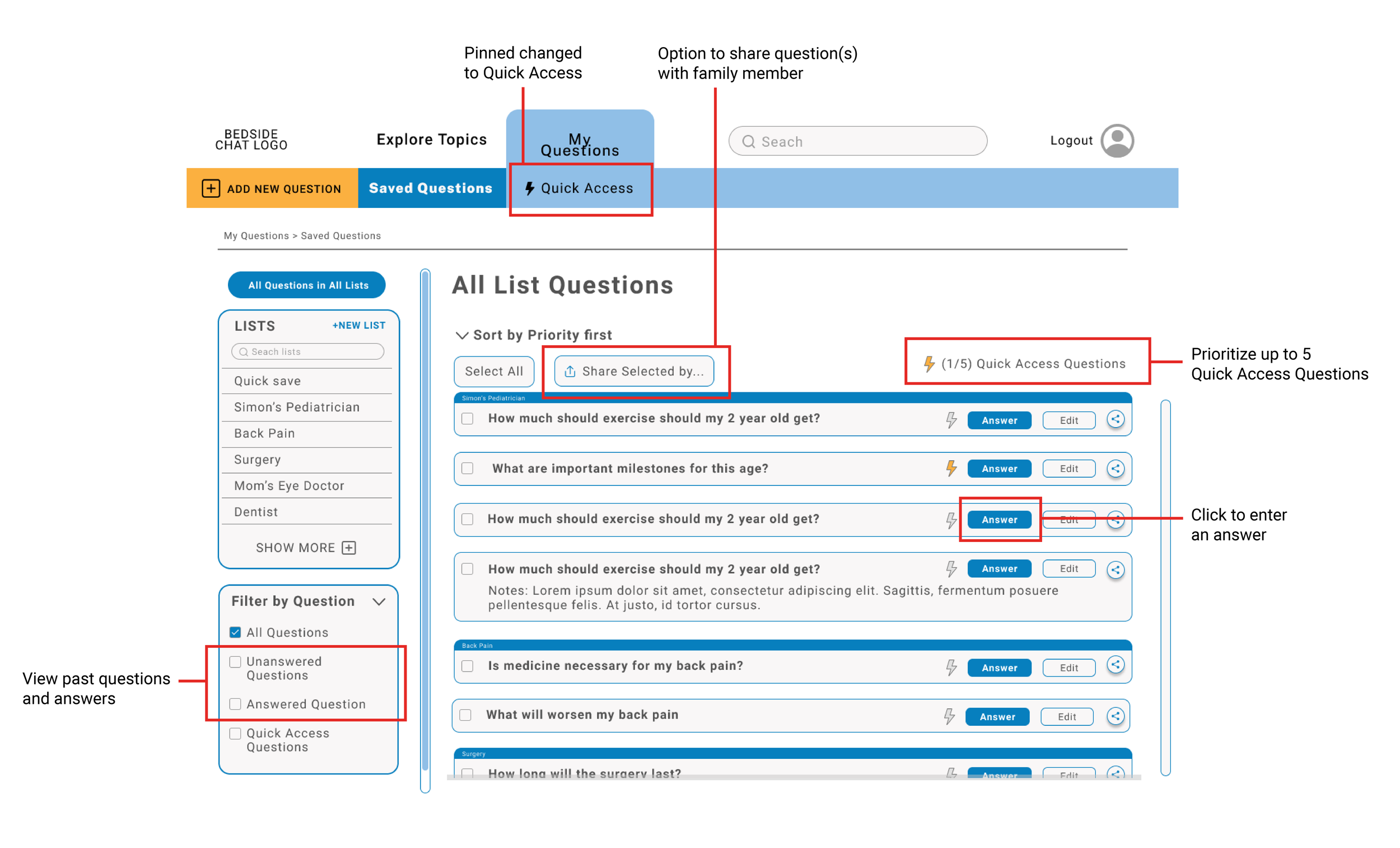
The website structure and navigation was a top priority due to the majority of participants experiencing difficulty understanding how various sections of the site relate to one other. “Pinned” was re-named “Quick Access” to closely match its intended purpose, addressing a common misunderstanding voiced by participants.
revised information architecture showing the main website functions
To address healthcare professionals’ concern that the tool may promote too many questions when time is limited, the “Quick Access” feature allows users to prioritize up to 5 questions that are most important to ask during their next visit helping patients and doctors use appointment time efficiently.
Providing patients the option to keep family or trusted individuals informed with preparation and visits is an included feature where users may select questions to share with others via email, text, or printing.
To give patients a record of their past questions and answers, the ability to input answers was added. Filtering by “Unanswered Questions” and “Answered Questions” allows users to easily and more specifically access information from previous doctor visits.
high-fidelity prototype: Saved Questions page
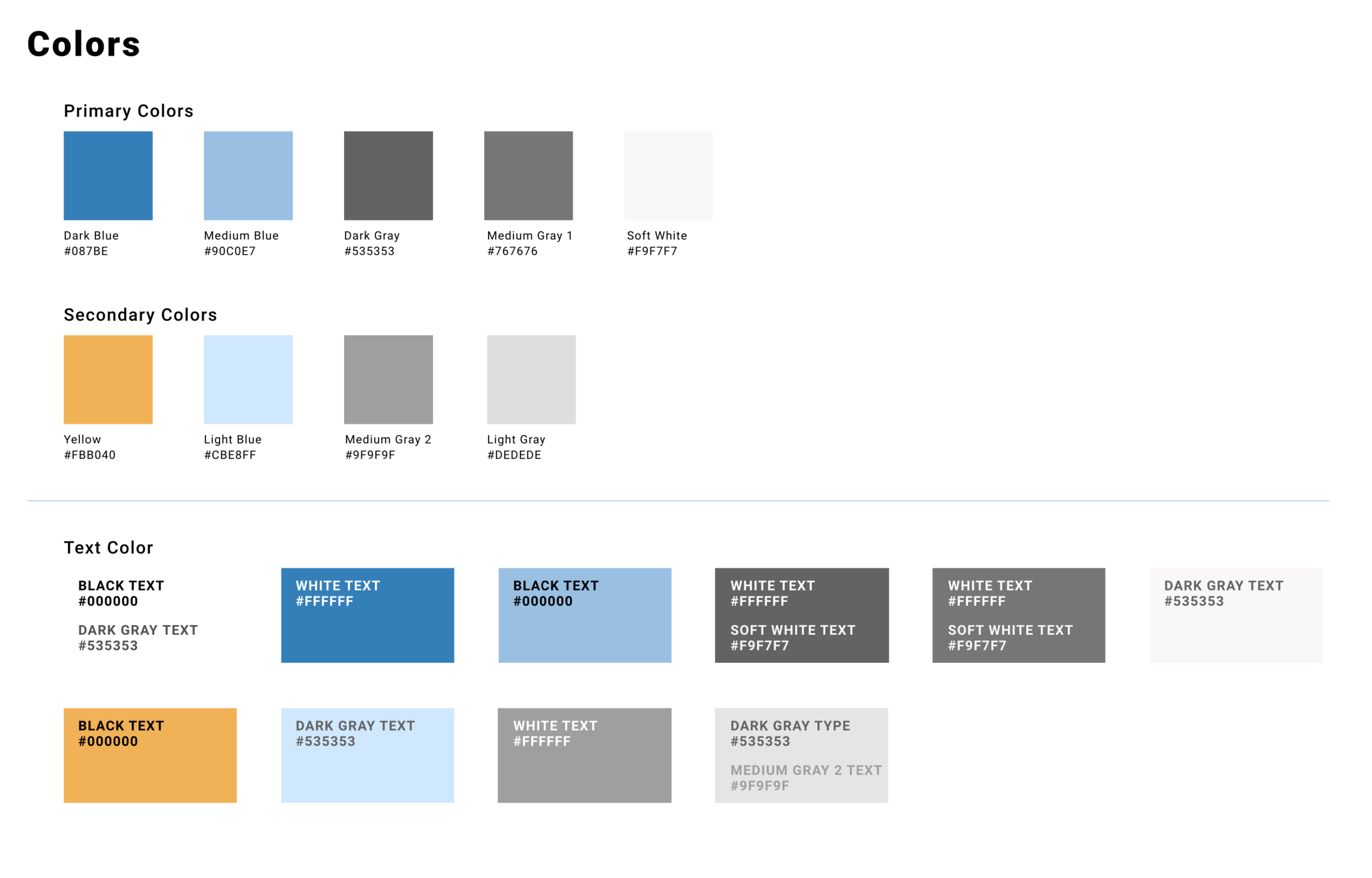
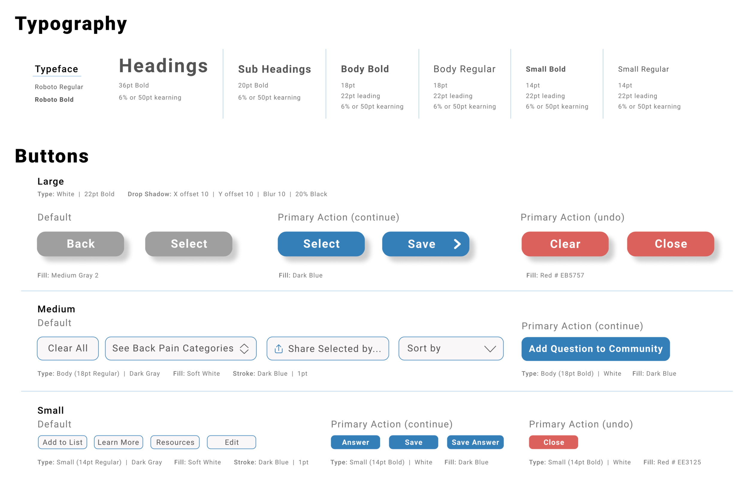
WEBSITE STYLE GUIDE
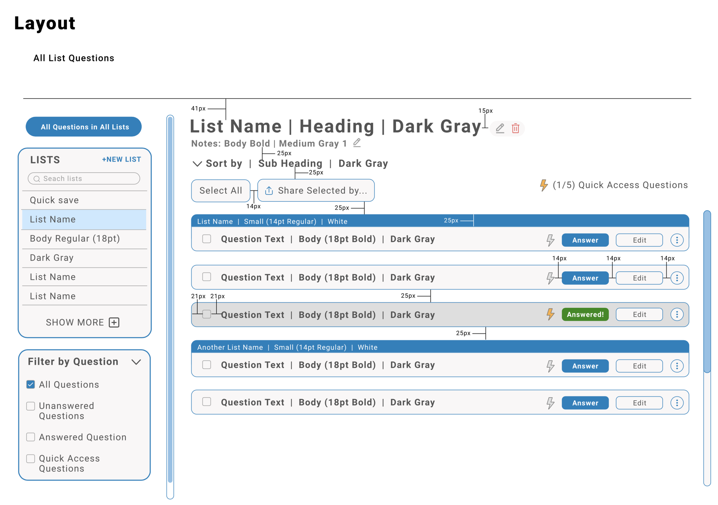
I created a website style guide to assist the future design and development team in creating the desktop-based website of the digital tool.
CONCLUSIONS
Takeaways:
The majority of patients agree that Bedside Chats would be helpful for all types of doctor’s visits and would use it themselves.
Healthcare professionals support the concept and would recommend it to patients.
Usability
Improvements to information architecture, navigation, and merging of content improved usability.
Usefulness
Participants say the digital tool is very useful for new diagnoses, surgeries, or patients who see a variety of doctors and specialists.
The tool is considered helpful for users who are forgetful.
Desirability
Patients and health practitioners view to the digital tool favorably and like the idea of sharing with family.
Suggested Future Steps:
Further improvements to the desktop-based website including a user guide and help section for less tech-savvy users.
Scaling down the website to tablet and mobile screen sizes.
Address patients’ concern for privacy and have developers ensure privacy protection is in place and made transparent to users.


